ASOS is UK's biggest online fashion and beauty retailer, it steadily increasing its market share in the international market, also it constantly improving its user experience. Let's take a look at the interface of ASOS websit.

1. Interface design
Their interface offers very clear and visible guidance which facilitate the navigation process. Global navigation, shopping bag and log-in area are clear and with good visibility.
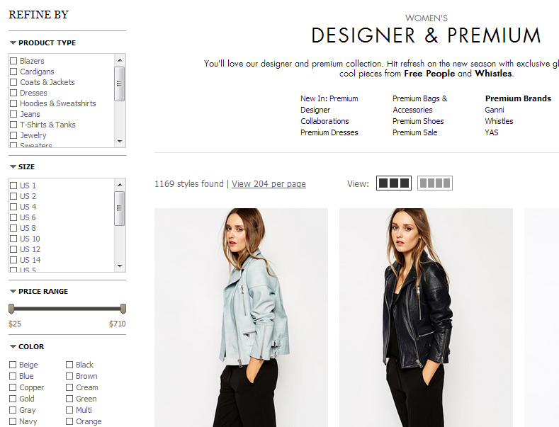
ASOS allow users to find products easily, they use a simple primary navigation which separates the audiences in two core group which are women and men and then use a mouse rollover on the mega drop down to clearly show all the product categories. With one click from the homepage you are into the list of products.

2. Provide an effective search
ASOS offers a precisely categorized content structure for user to easily access desired information. all items can be found through sub-menu links, search box and its comprehensive search refine options. Also ASOS use a faceted search to refine products, means that user are able to browse information by choosing from pre-determined categories, rather than displaying long lists of facets.

3. Listing layout that suits your product
ASOS provide personalized information, the application constantly learns from user's behavior thorough recording and analyzing each action and preference, then deliver the relevant contents such as "we recommend" "complete the look" button.

4. Invest quality imagery
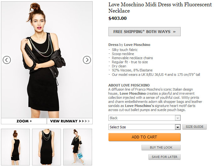
ASOS has several high quality images for every product on their website, most products have a 360 degree tour and increasingly more include a video catwalk. Because users want to see the product clearly, All uses have to rely on the product image to make online shopping, so ASOS allow users to have this great experience.
 5. Shopping bag works so well
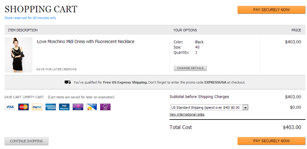
ASOS make absolutely clear to the visitor that the product has been added to their bag, and they have an intuitive link to view their bag if they wish. It is constantly accessible through the browsing journey, users can safely assume that when they decide to view their full shopping bag, and easy to check what they are choose to check out.
 6. Easy to check out
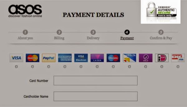
 Most eCommerce website forcing shoppers to register to make a purchase. ASOS actually do force all users to register before they make a purchase, but they do it very smart, because it realists that two additional fields required between a guest checkout and a registration is the one that asks for a password and another to confirm the password. Also ASOS remove any barriers and distractions in their checkout process, their forms are seamless, free of clutter and make good use of white space to remove any complexity and possible confusion.
At the end, I think ASOS has received huge success with their website by focusing on the user and their requirements.


